Criticism
All That Goes Unnoticed, Fifty Years On
At The Photographers' Gallery, William Eggleston's colour is shown as a printing process as much as a way of seeing, and the ordinary subject still wins the argument.
She is sitting in the driver's seat with the evening light across her face, clothes hanging behind her, one hand holding a small card up to the window as if the car were a booth and the photograph a toll. Nothing is happening, and the picture knows it. That is the William Eggleston wager, fifty years after it was first placed in public: that a woman in a parked car, photographed in saturated colour, deserves the same attention a history painting once commanded, and that the viewer's job is to stay in the frame until the attention feels natural.
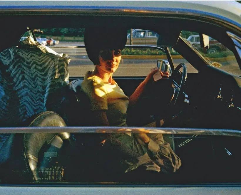
William Eggleston: All that goes unnoticed opened at The Photographers' Gallery in London on 14 October 2026 and runs to 21 February 2027. It marks the 50th anniversary of William Eggleston's Guide, the book published in 1976 with the exhibition at the Museum of Modern Art in New York, curated by John Szarkowski. The MoMA show was described as the first one-person exhibition of colour photographs in that museum's history, and it was controversial at the time. It is now recognised as a landmark. Anniversaries usually embalm a reputation; this one has a better excuse than most, because it can show the working underneath the reputation.
Eggleston, born in Memphis in 1939 and raised in the American South, began photographing in the late 1950s. The exhibition brings his celebrated colour photographs together with rarely seen vintage dye transfer prints, and with the black and white and Brownie images he made in the early 1960s and 1970s, before colour became central to his work. That sequencing matters. Seen first in black and white, his attention is already democratic and already perverse: the corner, the sign, the parked car, the room nobody would think to describe. Colour did not invent his way of seeing. It gave the seeing a temperature.
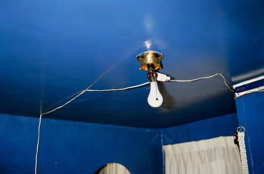
The blue ceiling makes the point without a person in it. A naked bulb hangs from a brass fitting in a ceiling painted a deep, swimming blue, the cord trailing across the paint like a crack in ice. In the gallery's own account of his method, colour in Eggleston is not decoration: a red ceiling, a green room or a blue sky can carry as much of the photograph as the person or object in it. The dye transfer process is the physical half of that claim. The image is separated into its constituent colours, and cyan, magenta and yellow dyes are transferred onto the paper one colour at a time, a laborious method that gave the printer unusual control over saturation and tone, and that is no longer used in current printing. His colour is not just what he photographed. It is how the photograph was printed, and the prints on the wall insist on the distinction.
The Guide itself contained 48 photographs, selected from a much larger body of work that included hundreds of images made between 1969 and 1971. What looks casual is considered: that is the sentence every Eggleston review eventually writes, and it happens to be true. The democratic approach, his own description of a practice in which all subjects possess equal visual importance, is a discipline disguised as indifference. The camera does not rank. The edit does.
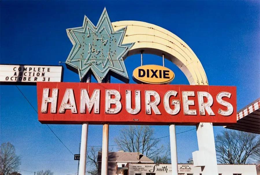
The Dixie Hamburgers sign, photographed in Memphis in the early 1970s, is the commercial version of the same discipline: a red board, white neon lettering, a starburst and a rainbow arc against a blue sky, with a smaller board at the edge announcing a complete auction. The exhibition sets Eggleston's colour against the visual culture that surrounded it, the advertising, television, supermarkets, roadside signage and commercial printing of the postwar South, and it considers what his frames hold in presence and absence, including the legacy of racial segregation. He was not photographing the large events of American history. He was photographing the world in which those events were being lived, and the sign is evidence: commerce as folk art, confidence as typography, a whole economy shouting in primary colours while the auction notice waits at the side of the frame.
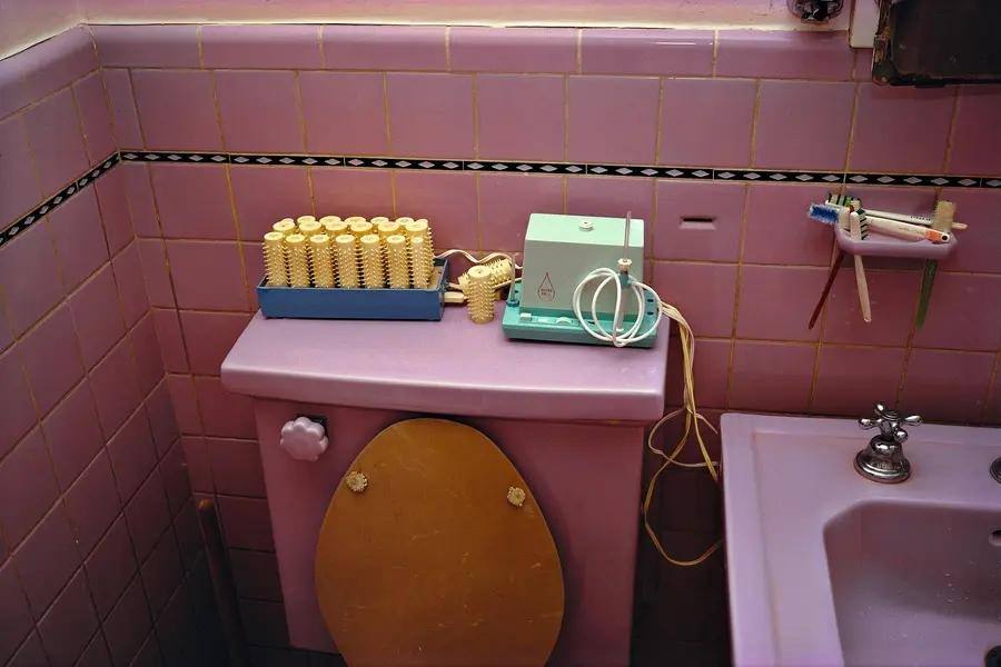
The pink bathroom closes the argument at domestic scale. Pink tiles, a pink cistern topped with a tray of yellow hair rollers and a small appliance, a wooden toilet seat down, toothbrushes in a holder at the sink: a room arranged for the daily manufacture of a self, rendered in the dye transfer palette until the banal becomes heraldic. Fifty years after the Guide, in a city full of people photographing their lunches in saturated colour for an audience of strangers, Eggleston's slowness is the radical element. His pictures ask the viewer to stop, to look at the corner of a room, to notice the colour of a wall. The exhibition, organised by The Photographers' Gallery in partnership with the Wilson Centre for Photography, earns its title. The unnoticed was never the subject. Noticing was.